Cougar relocated by Fish & Game from a cherry tree in Chelan, WA

Wednesday, March 31, 2010

Google Earth Project - Wind Farm Analysis


This project was to evaluate a wind farm near Bowling Green, OH then choose an appropriate site for a wind farm on the Great Lakes using Google Earth.  There were lots of links with additional information about average annual wind speeds, bird migration, etc.

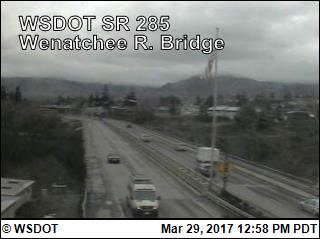
Google Earth shows two wind machines located near a landfill 6 miles southwest of Bowling Green, OH. There are two residences between 1200 and 1500 feet from the wind farm. There are approximately 20 other structures within a .5 to .75 mile buffer. The average annual wind speed is between 6.5 and 7.0 mph. The elevation is 677 feet.

I couldn’t find any complaints from locals about the Bowling Green wind farm on the listed links. I assume there was a fuss at some point or the Department of Health study would not have been created. The Department of Health was very thorough and addressed every conceivable concern.

I selected a site 6 miles east of Caseville, Michigan (population 835) based on my site assessment index from the BERR planning criteria.

- Average annual wind speed of 7.5 mph--the highest in the state.

- Elevation of 619 was similar to Bowling Green

- Nearest residence to the site was approximately .5 miles with very few homes within a 1 miles radius.

- The large building near the site appears to be some type of agricultural processing plant with a reservoir. The plant could also be for livestock and the reservoir could quite possibly be for manure. If that is the case, the smell factor would make it similar to Bowling Green’s landfill.

- No shipping ports or routes are near the site

- Positioned approximately six miles from the coast so the beauty of the coast and natural habitats will not be affected.

- Bird migratory patterns for this area are light although there are numerous species in the region.

- Electrical output from two 1.8-megawatt turbines could provide for the electrical needs of the village of Caseville and rural area around the wind farm site.

I saved two different map scales in Google Earth then opened the .jpeg in Ai so I could add some wind contours, scale and additional text.

Friday, March 26, 2010

Isohyet Precipitation Map of Georgia


This was overall a fun lab.  I finally figured out the pen, pencil and blob strokes in Ai.  Lots and lots of practice.  My first map had gaps between the polygons.  The only advantage with that approach was the labeling on the polyline is clearly understood.  The labeling on the above map can be misinterpreted for the area above or below the line. 

I decided to color the map to clearly identify the precipitation ranges.  I selected and filled all counties with a color corresponding to the contours.  Then I created a new layer--blobs and went to work trying to color within the lines.  I blobbed over a bunch of county lines and couldn't move the lines above the blobs since the county fill colors would have had hierarchy, so I copied the county outlines and added them into a new layer above blobs.

I had some issues with sizing this map.  The original document seemed to have some oversized boundaries.  I found two extra scale bars lost below the state boundary.  I was able to re-scale the basemap to 150%.  I added a neatline which was clearly visible in Ai but did not show up on the export??  I'm not totally satisfied with my polygoning in the northeast part of the state but overall I think the final output is good.

Monday, March 22, 2010

Bonus Exercise


I had a difficult time choosing what map to try to “improve” with the examples given in the ESRI link. I chose the thematic map using 3D symbols. I chose my map from the proportional symbol lab not because I was dissatisfied with the outcome but because I wanted to try some new techniques.
In an effort to create 3D symbols on the map, I had to transform my data from linear to volumetric. I added a new field to the layer and calculated the field with the following VB expression:

       (([field] / 3.141592) * 0.75)^(1/3)

This created a range of numbers from 0 to 20. I was then able to symbolize the layer using either proportional or graduated symbols. I was not able to get a decent looking range of symbols using graduated so I chose proportional symbols. I still wasn’t satisfied with how ArcMap handled proportional symbols so I converted the symbols to graphics and customized the sizes to better suit the data. In the end the symbols did not look anything like 3D.

I created a simple legend by copying a symbol in data view and pasting in layout view then moving it into place. Again, my symbols looked nothing like the 3D examples but I liked how the text was displayed and how the symbols were slightly grouped. The symbols in the legend did form a hierarchy of first one copied and pasted was on the bottom. I tried using the graphics toolbar to move a symbol forward or backward without success.

The final technique I tried was deemphasizing the labels for the countries with very low consumption by changing to a lighter color. I converted the labels to annotation and selected a 70% gray color for the countries with low wine consumption. I think this simple technique worked well.

Although this exercise wasn’t a complete success, I did learn a couple of great new skills that may be more useful in a different application. I also now believe Adobe Illustrator is the way to go for a map like this.

Monday, March 8, 2010

Wk 9 - Immigration to the US Flow map

I'm actually starting to like Adobe Illustrator;)  This is a flow map showing immigration to the U.S. in 2007 by region.  I chose to break up the Americas region becuase it accounted for more than 40 percent of the total immigration and it was distributed  into 5 sub regions.  I experiemented with various projections in ArcMap and finally settled on Mercator.  I wanted to color ramp the regions so I added a "region" field in ArcCatalog then classified each country. 

 I wasn't able to master using the Pen tool in Ai but I found success with the Arc tool.  I still can't figure out how to draw text along a path; however, I'm not sure it would have been the best solution to identify the line values.  The add arrowhead feature in Ai is slick.  I used different percentages for different sized lines to get the look I wanted.  I'm definately a happier camper when I first get to control the data in ArcMap and use Ai for special affects and polish.

Sunday, March 7, 2010

Wk 8 - Dot Density Map - Florida Housing Density

This map was created with Adobe Illustrator from an image provided.  This image wasn't of good quality and really needed the coastlines generalized so the complex geography wouldn't end up just a blur of ink. I was able to scale the image to 150 percent.  I tried to scale beyond that and crashed Ai everytime. 

I attempted to follow the lab instructions by taking the county with the highest housing density and adding as many dots as possible so dots just begin to coalesce.  The other requirement was all counties must have a dot if there is data.  Since, according to my calculations, Liberty County had 3.74 housing units per acre, the largest dot value couldn't exceed 3.74.  That meant 211 dots had to go into Pinelas County.  I wasn't close to fitting that many dots, so I copied and off set the four counties with the highest density and expanded them by 100 percent.  I also increased the dot size by 100 percent for those four counties.  This allowed me me fill the counties according to good dot density placement while still being able to see a single dot on the map.  Bi-focals didn't help this project.  There are 1807 dots on this map.

I chose to leave the three filters (wetlands, lakes, rivers) off my finished map.  I think the filters detracted from the finished map and made it difficult to see the pattern of the dots.  I'm glad this lab wasn't earlier in the semester--it definately made me feel like I earned a Spring Break.